The Latest Redesign
Welcome back to my blog. If you’re a regular visitor, you’ll probably notice that there have been a few changes around here. If you’re new, welcome. I hope you’ll subscribe for email updates or my RSS feed.
That’s right, I’ve taken the opportunity to have a bit of a redesign. I used to do this pretty regularly, but I’ve spent the last year trying to stop doing that and focus more on the content that I’m creating rather than messing around with the theme all the time. That said, I was starting to get a little bit bored and a couple of things came up that encouraged me to make the change.
Why Now?
Firstly, like I say, I was getting to the point where I felt like a change from the theme. The eleven40 theme is beautiful and is ideal for a blog site like this; it puts the content front and centre, it’s responsive and has all the benefits that come from using the Genesis Framework (aff), but I’ve had it for almost eighteen months and I felt like a change.
Secondly, with Studiopress releasing Genesis 2.0 and, naturally, including a lot of shiny new things like HTML 5 support, addition of schema code and more, the timing felt right. I’m one of those people that always wants to use the shiniest new thing as soon as it comes out and with Genesis 2.0’s release combined with the fact that I was thinking of getting a new theme, it made sense to do the two things at once.
Enter Themedy

So when I started looking around for themes that would give me the ability to leverage the new capabilities of Genesis, but would look the part, whilst giving me the flexibility I needed to make it my own, I came across Themedy’s range (aff), and I’m so glad I did.
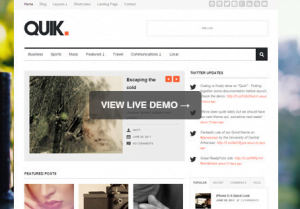
I chose the Quik theme and used a lot of the internal settings, combined with a few plugins to get it looking how I wanted. There’s still a fair bit of work to be done on the look and the Schema side of things (plugins are pretty useless for that, to be honest), but I’m really happy with the way it’s coming together. I’m also really liking the responsive aspects of the design and the fact that it didn’t take any extra work to make it html5 – this theme just switches over if you’ve got it enabled in Genesis. How cool is that?! It also enabled me to delete a lot of the plugins that I was using previously as Themedy themes bring a lot of the functionality that I wanted as standard, which is always nice.
Other Changes
I’ve been experimenting with a few different tracking options at work, looking into things other than Google Analytics and, although I didn’t want to ditch Google Analytics, I’ve become very interested in the capabilities of Mixpanel, so I was keen to set it up here.
Mixpanel is a website analytics suite that focuses more on events than page views, so there’s a bit of a difference there, but I’m finding using it really interesting. It’s also much easier to segment your data than it is in Google Analytics, so if you’re not too hot on GA or you’re pushed for time and want your answers now, this is a great backup.
Setting up Mixpanel on WordPress isn’t as easy as Google Analytics as there is no official plugin yet (why?), but Zippykid has done a great job of putting one together here. I’m quite new to Mixpanel, but I’m really liking its interface and I can see myself using this on client sites in future, particularly those that have interactions with their site as a goal.
I’ve also been getting more interested in creating proper landing pages for things like my email sign up page and, although Themedy has a landing page designer, I prefer the Visual Composer from WPBakery, which lets me build pages with drag-and-drop functionality. This combined with the Widgetise Pages and Widget Controller plugins really does make for the ultimate combination for easy, affordable landing page design. Check it out and keep your eye out for a post based around how this works. If my email subscription and About pages don’t encourage you to sign up, please tell me so I’ll know they need some work.
A New Beginning – Again
I know I keep referring to this old post, but I’m really hoping that this new design will be a new start for this site and that it will push me to work on it more frequently.
I’ve got an eBook in the works and this site does OK from a monetisation perspective when I take the time to be writing on it regularly, so hopefully with a new design, I’ll write on it more often and do that thing I do all day, which is basically my approach to SEO; create something useful on a site that works and tell people about it.
Here’s hoping.
What do you think of the new design? Let me know in the comments, if you’re so inclined.

