R For SEO Part 3: Data Visualisation With GGPlot2 & Wordcloud
Welcome back. You’ve made it to part three, where we’re going to start having a bit of fun with the R language and SEO data. Hopefully the first couple of parts gave you a bit of a grounding in the basics, how to use R packages and how to get Google Analytics and Search Console data in R. Today, we’re going to do some simple visualisation work on that data using the GGPlot2 package.
In today’s piece, we’re going to use the GGPlot2 package and some Google Analytics and Search Console data to make basic bar charts, line graphs, a combo plot and finally a really cool wordcloud with our search queries.
I know today’s piece is super late. Work has been crazy and I’ve been moving house, which comes with its own fun challenges.
Ready to get started? Alright, let’s do this.
Contents
The GGPlot2 Package And The Tidyverse
In part 2, we discussed the Tidyverse series of packages and how great it is. GGPlot2 is part of that package, so we’ll be initialising it that way.
GGPlot2 is the industry standard for visualising data using R and, truthfully, I’ve not come across a better package for this purpose. There are debates between GGPlot2 and MatPlotLib for Python, but personally, I tend to skew towards GGPlot2’s Python equivalent plotnine since it uses the same Grammar of Graphics approach and it’s just familiar when I use Python.
If you feel you’re going to be doing a lot of data visualisation during your R journey, it’s really worth getting familiar with the concepts behind the Grammar of Graphics, so there’s some further reading for you. I’m not going to go into it here, today’s all about the mechanics of using GGPlot2 with Google Analytics and Search Console data so we can make some SEO-specific graphs.
First, let’s start by installing the packages we’re going to use today.
Installing Our Packages
Today, we’re going to use the following packages:
- Tidyverse: As mentioned before, GGPlot2 is included in this, but it’s always worth having the other packages installed as well
- googleAnalyticsR: We ran through this in the last part, but this is the standard package for pulling Google Analtyics data directly into R
- googleSearchConsoleR: Again, we covered this last time, but this is how we get Google Search Console data into our R environment
- wordcloud: The standard package for creating wordclouds using R
- tm: My favourite package for text mining and cleaning
Now we know which packages we’re going to use for this exercise, let’s try and be efficient and install them all at once.
instPacks <- c("tidyverse", "googleAnalyticsR", "searchConsoleR", "googleAuthR", "tm", "wordcloud")

lapply(instPacks, require, character.only = TRUE)
Now we’ve got our packages installed, follow the authorisation steps from the previous piece and we can start getting some SEO data to visualise.
Our Datasets
We’re going to create four initial datasets for our first graphs:
- Organic sessions over last 30 days: We’ll use this to build our very first line graph
- Organic sessions over last 30 days compared to previous period: Our second graph will have two lines, comparing the last 30 days to the previous 30 days
- Impressions over last 30 days: We’ll use this for our first bar chart
- Impressions & clicks over last 30 days: This will build our first combo chart with dual axes
Let’s get our Google Analytics datasets for our initial visualisations.
Google Analytics Datasets For Our Visualisations
As we covered in the last part, let’s pull some basic Google Analytics data using the organic segment and breaking it down by date. Remember to go through the authorisation steps and to replicate the View ID/ segment identification stages for your own data. I’ve replaced my IDs with X for the purposes of this piece.
ga_auth()

gaAccounts <- ga_account_list()

viewID <- gaAccounts$viewId[X]

orgSegment <- segment_ga4("orgSegment", segment_id = "gaid::-X")

ga30Days <- google_analytics(viewID, date_range =c("30DaysAgo","yesterday"), metrics = c("sessions"), dimensions = "date",segment= orgSegment)
This is the basic one that we’ll use for our very first visualisation, but we’ll also want to use a comparison range for our second, so let’s get that data as well.
GADataComparison <- google_analytics(viewID, date_range =c("60DaysAgo", "31DaysAgo", "30DaysAgo","yesterday"), metrics = c("sessions"), dimensions = "date", segment= orgSegment)
Now we’ve got everything we need from Google Analytics, let’s get the datasets we need from Google Search Console to visualise.
Google Search Console Datasets
First, we want to get our data split out over the last 30 days. With the way googleSearchConsoleR works, we can get it all in one call, which is pretty handy, considering the graphs we want to make from it. We just need the following commands, including the authorisation steps we talked about in the last piece:
scr_auth()

scDataByDate <- search_analytics("YOUR SITE", startDate = Sys.Date() -30, Sys.Date() -1, searchType = "web", dimensions = "date")
This call will actually give use what we need for both the Google Search Console graphs we’re going to build, so this is nice and easy. Obviously replace “YOUR SITE” with your site, but don’t forget the speech marks.
OK, now we’ve finally got our data, let’s start building some graphs.
GGPlot2 For SEO
GGPlot2 is a very powerful and flexible graphing library, and you can make pretty much any data visualisation you can imagine with it, once you learn how it works. Data Visualisation With R by Thomas Rahlf is a fantastic resource to expand on this, if data visualisation is your jam.
A Basic GGPlot2 Line Graph With Google Analytics Data
Firstly, we want to use our Google Analytics dataframe to give us a simple line graph of the last 30 days of organic search data. This will be our first GGPlot2 visualisation command in R, so I’ll break it down afterwards.
ggplot(data=ga30Days, aes(x=date, y=sessions)) +
  geom_line(colour="darkgreen", stat="identity") + xlab("Date") + ylab("Sessions")
This gives us the following graph:
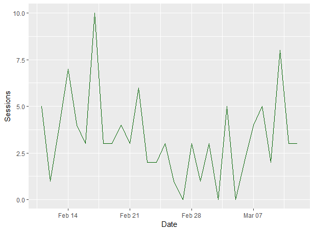
We’ll talk about how to export GGPlot2 graphs from RStudio later, but for now, let’s break that command down so you can see how we put this graph together.
- ggplot(data=ga30Days, aes(x=date, y=sessions)): We’re invoking the ggplot command, telling it what data we want to use (our ga30Days set in this case) and telling it which axes it should use
- +: This is how we break up a command across multiple lines in R so that we can get it all on one screen
- geom_line(colour=”darkgreen”: We’re using the line graph method of visualising this chart and we’re using dark green for the colour. In the EN-US language, you’d be using “color”
- , stat=”identity”): We’re basing the scale on the numbers of the dataset
- + xlab(“Date”) + ylab(“Sessions”): We’re labelling the X and Y axes according to our datasets. “Date” and “Sessions” in this case
Now we’ve got a bit of an understanding of how to put a chart together in GGPlot2, let’s start expanding them with a secondary series.
Creating Comparison Line Graphs With Google Analytics Data In R
Now we know how to create a single line graph in R with GGPlot2, we should think about adding comparison lines so our SEO reports can show changes. Here’s how we can do that.
First we need to do a little bit of preparation on our data so the two lines can be layered against the same date range. We’ll do that with subsetting and creating a new frame so the two date ranges are a clear comparison.
GADataComparisonLast30 <- GADataComparison$sessions.d2[31:60]

GADataComparisonPrev30 <- GADataComparison$sessions.d1[1:30]

GADataComparisonVis <- data.frame(GADataComparison$date[31:60], GADataComparisonLast30, GADataComparisonPrev30)

colnames(GADataComparisonVis) <- c("Date", "Sessions Last 30 Days", "Sessions Previous 30 Days")
Now we can add a second line to our chart like so:
ggplot(data=GADataComparisonVis) +
  geom_line(aes(y=GADataComparisonLast30, x=Date), colour="darkgreen") +
  geom_line(aes(y=GADataComparisondPrev30, x=Date), colour="black")
And that’ll give us the following chart:
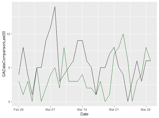
You can see that we’ve added the colours parameter to our original command which adds the secondary line and I’ve used the “darkgreen” colour for it, because it matches my site’s theme.
And that’s a really simple introduction to line charts using Google Analytics data in GGPlot2.
Building Bar Charts With Search Console Data In GGPlot2
Now we’ve learned how to build basic line graphs, let’s use our Google Search Console dataset to build up a bar chart of impressions over the last 30 days with GGPlot2.
Here’s how to do that:
ggplot(data=scDataByDate) +
 geom_col(aes(date, impressions), size = 1, colour = "black", fill = "darkgrey")
This will give us the following graph (again, your numbers will be different and almost certainly higher):
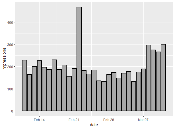
As before, let’s break the command down:
- ggplot(data=scDataByDate): As before, we’re calling the ggplot command and saying what dataset we’re focusing on
- geom_col(aes(date, impressions): In this case, we’re using the geom_col command to tell ggplot that we’re using a column graph, and the axes are date and impressions
- size = 1, colour = “black”, fill = “darkgrey”): These are styling commands, where we’re saying that we want our bar size to be standard (you can play with this a lot when you have different size datasets) and we want the outline colour to be black and the fill colour to be dark grey
As you can see, there’s not much difference between geom_line and geom_bar. The main changes are that we’re adding a fill parameter for the columns.
So that’s how we can build a basic bar chart in GGPlot2 using Google Search Console impression data. Now let’s build up a combo chart of clicks and impressions.
Building A Combo Chart Of Google Search Console Impressions & Clicks In GGPlot2
We covered this a bit in my post about Keyword Clustering for SEO, but I thought it was worth including and expanding in today’s piece.
What we’re going to do here is create a bar chart of impressions as above, but also add a line chart of clicks on a secondary axis. A quick disclaimer is that us analysts generally hate combo charts like this because they make it very easy for the end user to misinterpret the data, but it’s something that people ask a lot, so it’s worth covering for this specific use case.
Use the following command:
ggplot(scDataByDate) +
  geom_col(aes(date, impressions), size = 1, colour = "black", fill = "darkgrey") +
  geom_line(aes(date, 50*clicks), size = 1, colour = "darkgreen", group =1) +
  scale_y_continuous(sec.axis = sec_axis(~./50, name = "clicks"))
And this will give the following chart using my dataset:
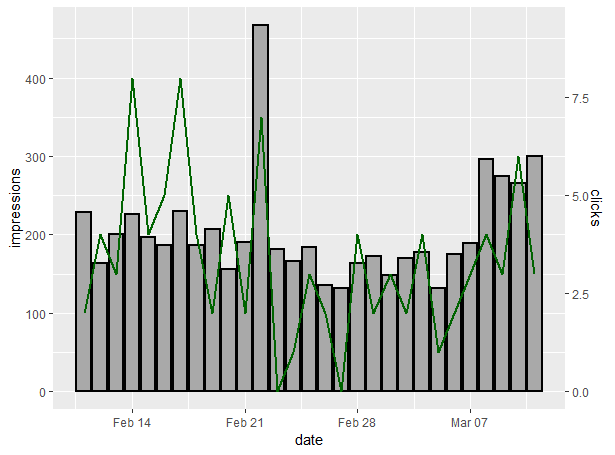
Let’s break it down:
- ggplot(scDataByDate): As always, we’re calling the ggplot command and defining the dataset
- geom_col(aes(date, impressions), size = 1, colour = “black”, fill = “darkgrey”): As before, we’re building our bar chart
- geom_line(aes(date, 50*clicks), size = 1, colour = “darkgreen”, group =1) + scale_y_continuous(sec.axis = sec_axis(~./50, name = “clicks”)): Here, we’re building our secondary axis for clicks. Excel or other tools will usually scale this for you automatically, but with R, we have to do that manually. Since my CTR over this time period wasn’t great compared to my visibility, I’ve scaled it to 50*. Assuming you spend more time on your own site, you can adapt accordingly
There we have it: a quick guide to building combo charts in R using Google Search Console’s impressions and clicks data.
Now we’re going to do our final visualisation of this piece: a wordcloud of our search queries using Google Search Console data.
Creating Wordclouds In R Using Google Search Console Data
We’re going to use the wordcloud R package for this part, rather than GGPlot2, but it’s still fairly simple. What we’re going to do here is create a wordcloud using our Google Search Console queries over the last 30 days.
Firstly, as always, we’ve got to prepare our data:
Google Search Console Query Data In R
As before when we added the date dimension to our googleSearchConsoleR query, we’re going to break it down with the query dimension.
Here’s how to do that:
scDataByQuery <- search_analytics("YOUR SITE", startDate = Sys.Date() -30, Sys.Date() -1, searchType = "web", dimensions = "query")
As you can see, the only difference between this query and the one we used in part 2 is that we changed the dimension parameter to “query” instead of “date”, meaning it’s broken down by search term instead of by date.
Now, similar to the Keyword Clustering post, we’ve got to clean up our dataset so it can be easily interpreted and remove potential duplicates, which means turning it into a corpus – a “bag of words”, essentially, and then making sure it’s tidied up.
Creating & Cleaning A Text Corpus In R
You’re figuring out that there’s always some data-prep work to do before making your visualisations now, right?
Firstly, we’ve got to use the tm (text mining) package to create a corpus from our Search Console queries. We already installed tm at the start of this piece, so now we just need to run the following command:
queryCorpus <- Corpus(VectorSource(scDataByQuery$query))
Now if you explore that using the “queryCorpus” command, you’ll get the following:

Not especially helpful at this point, right? And certainly not ready for a wordcloud.
That’s why we have to clean it up.
Why We Clean Text Corpuses
Text analysis is one of the main things I do with R, and something I’ve done for a lot of my SEO clients over the years. There’s a lot to go into with it and I’m not going to run through it all in this series, but hopefully this very brief introduction will whet your appetite to explore it further.
If it does, the book Text Mining With R by Julia Silge and David Robinson is a fantastic resource and well worth a read.
Essentially, the reason we clean a corpus is to avoid duplication and miscounting. In a pure corpus, a word beginning with a capital and fully lowercase will be counted separately, as will plurals and the many variations that can come along with that. You’ll also find that “stopwords” such as “and”, “the” and so on will be counted, and they’ll probably outnumber the words we want to focus on. When we clean a corpus, we eliminate this duplication by doing the following:
- Make everything lowercase: This ensures consistency of our words, eliminating duplicates caused by capitalisation
- Remove punctuation: Punctuation marks can cause further duplication or variations of words which we don’t want
- “Stem” our words: This removes extensions, thus removing duplicates caused by pluralisation. Some of the words may look a little strange, but it’s still easy to figure them out
- Remove “stopwords”: We want to keep our key terms here rather than including words like “the” and “and” and so on. These will skew our text numbers
OK, now we know what we’re going to do, let’s run it. We’re going to have a few commands to use here. I showed you how to combine it into a single R function in my Keyword Clustering post, but for now, let’s break it down:
Making A Corpus Lowercase In R
We’re going to use our Google Search Console query corpus that we created in the last step to run the tolower command from the tm R package, like so. You’ll see that we’re rewriting our initial queryCorpus dataset to do this.
queryCorpus <- tm_map(queryCorpus, tolower)
Simple as that. Now our entire Search Console query corpus is in lowercase.
Removing Punctuation In An R Corpus
Removing punctuation is an important step in text analysis. Punctuation can cause unwanted variants, such as hyphenated words being counted as one and in general, we don’t want it around when we’re analysing text. Fortunately, removing it is as simple as one single command, thanks to the tm package:
queryCorpus <- tm_map(queryCorpus, removePunctuation)
And now we’ve gotten rid of any punctuation elements from our Search Console queries.
Removing Stopwords In An R Corpus
For the next stage of our data preparation, we need to remove the stopwords from our corpus, words like “if”, “and”, “it”, “the” and so on; words that will interfere with our analysis of our query data.
We can do that with the following command:
queryCorpus <- tm_map(queryCorpus, removeWords,(stopwords("english")))
We’re almost there with cleaning our corpus. Now we just need to take the words down to their stems to remove pluralisation duplication.
Stemming Words In An R Corpus
Finally, we need to remove all the possible duplications caused by pluralisation and the many different ways that people can pluralise search terms. Again, using the tm package, we can use the following command:
queryCorpus <- tm_map(queryCorpus, stemDocument)
We’re still rewriting our original corpus, but now all the words will be in lowercase, punctuation and stopwords are gone and all the possible extensions have been removed through taking the words down to their stems.
If you’ve followed all these steps, you’ll have a clean corpus of your Google Search Console query data and we’re ready to move on to create our wordcloud.
Our Wordcloud With Google Search Console Query Data In R
I know it can feel like a lot of heavy lifting to get to this point, with all the data cleaning and preparation, but I promise it’ll get easier when we follow the steps in the next few sessions, particularly the piece when we discuss functions. But now, we’re ready to create our wordcloud with our Google Search Console query data.
We can do that with the following command using the wordcloud R package, which we installed earlier:
wordcloud(queryCorpus, scale=c(3,0.4), max.words=350, random.order=FALSE,
          rot.per=0.35, use.r.layout=FALSE, colors=brewer.pal(8,"Dark2"))
Obviously your output will be different, since your site will have different queries, but you’ll get something similar to this:
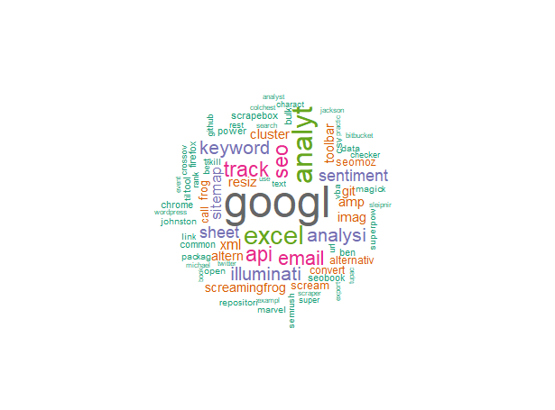
Now we know how to create a wordcloud in R, let’s break down the command so you can edit it in the future:
- wordcloud(queryCorpus: We’re calling the wordcloud command from our wordcloud package and using the queryCorpus dataset
- scale=c(3,0.4), max.words=350, random.order=FALSE: We’re putting a small scale on the image (you can adapt as required), putting a limit on the maximum words of 350 and saying that we don’t want to randominse the order of words
- rot.per=0.35, use.r.layout=FALSE, colors=brewer.pal(8,”Dark2″)): We’re putting a 0.35 level of rotation on the visualisation and using the RColorBrewer’s Dark2 colour scheme
Now we’ve had a bit of fun with SEO data visualisation in R, let’s get those graphics exported to use in reports or presentations.
Exporting Data Visualisations In RStudio
Saving your R plots to graphics files like JPG or PNG to use in your reports or presentations is really easy with RStudio. You just go to your plot window and click the “export” button, like so:
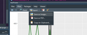
You’ll get a few options around the file type. I typically go for PNG so the filesize is small, but you can use whatever works for you.
Now you’ll have a download of your plot in your chosen file type in your R project directory.
Wrapping Up
And there we have it. A simple introduction to using GGPlot2 and wordcloud to visualise your SEO data using R. As always, if you’ve got any questions, hit me up on Twitter and be sure to sign up to my mailing list to get notified of my next piece of content.
Next time, we’re going to start taking R to the next level and look at functions. I hope you’ll join me.
Our Code From Today
# Install Packages

instPacks <- c("tidyverse", "googleAnalyticsR", "searchConsoleR", "googleAuthR", "tm", "wordcloud")

lapply(instPacks, require, character.only = TRUE)

# Authorise Google Analytics

ga_auth()

gaAccounts <- ga_account_list()

viewID <- gaAccounts$viewId[7]

# Get Google Analtyics Data

orgSegment <- segment_ga4("orgSegment", segment_id = "gaid::-5")

ga30Days <- google_analytics(viewID, date_range =c("30DaysAgo","yesterday"), metrics = "sessions",
                             dimensions = "date",segment= orgSegment)

GADataComparison <- google_analytics(viewID, date_range =c("60DaysAgo", "31DaysAgo", "30DaysAgo","yesterday"), metrics = "sessions",
                                     dimensions = "date",segment= orgSegment)

# Get Search Console Data

scr_auth()

scDataByDate <- search_analytics("YOUR SITE", startDate = Sys.Date() -30, Sys.Date() -1, searchType = "web", dimensions = "date")

# Basic Line Graph With 30 Days Data

ggplot(data=ga30Days, aes(x=date, y=sessions)) +
  geom_line(colour="darkgreen", stat="identity") + xlab("Date") + ylab("Sessions")

## Comparison Data

GADataComparisonLast30 <- GADataComparison$sessions.d2[31:60]

GADataComparisonPrev30 <- GADataComparison$sessions.d1[1:30]

GADataComparisonVis <- data.frame(GADataComparison$date[31:60], GADataComparisonLast30, GADataComparisonPrev30)

colnames(GADataComparisonVis) <- c("Date", "Sessions Last 30 Days", "Sessions Previous 30 Days")

## Comparison Line Chart

ggplot(data=GADataComparisonVis) +
  geom_line(aes(y=GADataComparisonLast30, x=Date), colour="darkgreen") +
  geom_line(aes(y=GADataComparisondPrev30, x=Date), colour="black")

# Bar Chart From SC Impressions

ggplot(data=scDataByDate) +
 geom_col(aes(date, impressions), size = 1, colour = "black", fill = "darkgrey")

## Combo Chart With SC Impressions & Clicks

ggplot(scDataByDate)+
  geom_col(aes(date, impressions), size = 1, colour = "black", fill = "darkgrey")+
  geom_line(aes(date, 50*clicks), size = 1, colour = "darkgreen", group =1)+
  scale_y_continuous(sec.axis = sec_axis(~./50, name = "clicks"))

# Wordcloud With Search Console Queries

## Get Query Data

scDataByQuery <- search_analytics("YOUR SITE", startDate = Sys.Date() -30, Sys.Date() -1, searchType = "web", dimensions = "query")

## Convert Queries To Corpus

queryCorpus <- Corpus(VectorSource(scDataByQuery$query))

## Convert Corpus To Lower Case

queryCorpus <- tm_map(queryCorpus, tolower)

## Remove Punctuation

queryCorpus <- tm_map(queryCorpus removePunctuation)

## Remove Stopwords

queryCorpus <- tm_map(queryCorpus, removeWords,(stopwords("english")))

## Stem Words

queryCorpus <- tm_map(queryCorpus, stemDocument)

## Create Wordcloud

wordcloud(queryCorpus, scale=c(3,0.4), max.words=350, random.order=FALSE,
          rot.per=0.35, use.r.layout=FALSE, colors=brewer.pal(8,"Dark2"))

